
Blue Shield of California Medicare site redesign
I designed a microsite to inform prospective Medicare customers and serve as a benefits resource for members
Services
Competitive analysis
Responsive UI design
Wireframing and prototyping
Ideation and research synthesis
Developer collaboration
Deliverables
Detailed user journey map
High-fidelity mockups with specs in 4 responsive web breakpoints
All-new style guide
Multiple rounds of prototypes for user testing
7 new scalable CMS templates
Outcomes
Working within a tight timeline, we delivered a polished website ready for Open Enrollment traffic
The new site reduced bounce rate & increased session duration over the old site in the same period last year
We assembled a backlog of data-driven recommendations to add to the product roadmap
Challenge
Design a compelling and contemporary website to serve prospects and members while balancing multiple stakeholder needs and introducing an all-new visual look and feel
Blue Shield had 3 disparate Medicare sites that were providing confusing information. One was a vendor-hosted acquisition/sales site, one was the internally hosted microsite, and one was internally hosted but shared space with the Medi-Cal line of business. Our goal was to create one internally-hosted microsite that could serve as an acquisition and exploration site, informing prospective members of their plan options as well as an unauthenticated resource for current members, where they could find information about their benefits, forms, and other resources.
Approach
Design a series of versatile templates based on competitive research, usability testing, and iteration

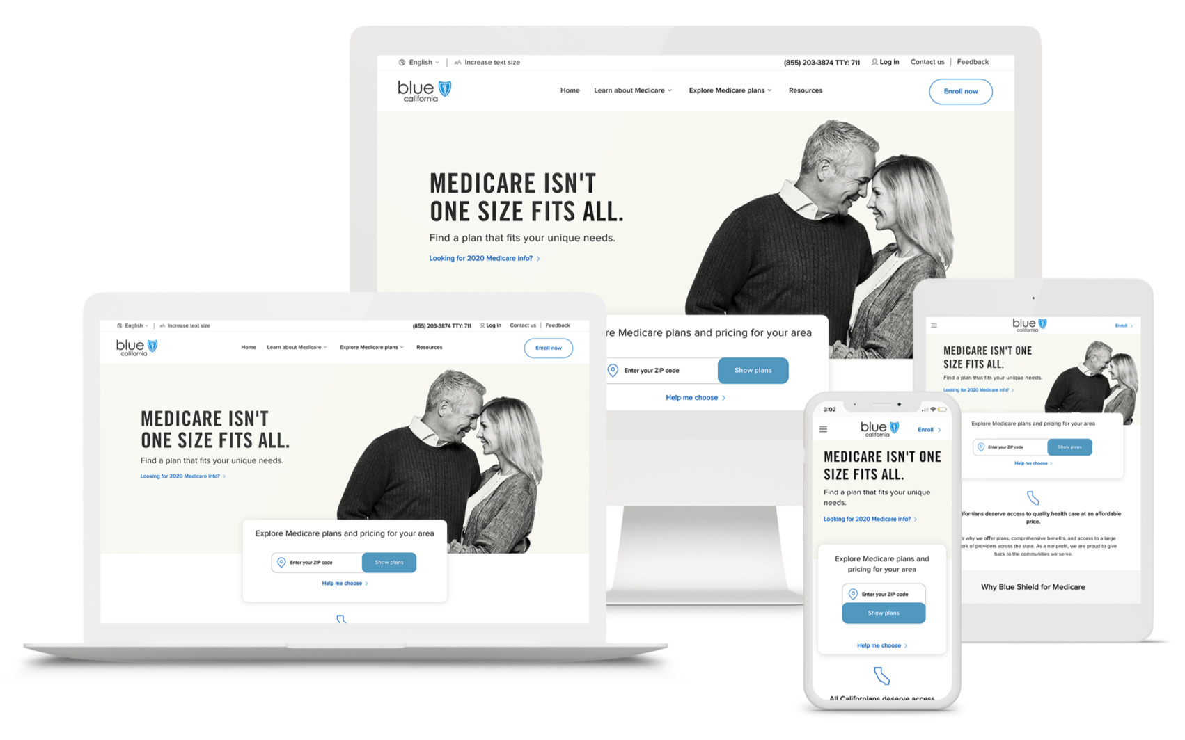
Every template was responsive from 320px to 1600px
User behavior drove this design.
As if the various options for different plans wasn’t confusing enough, user research was showing that people didn’t even understand the basics of Medicare itself. Before being able to choose a specific plan, they needed to understand what the difference was between Medicare Advantage and Medicare Supplement. Therefore we conducted competitive analysis and did some benchmark testing on a few different methods of communicating that information. One was a simple quiz: Do you travel? Do you have a specific doctor you want to see? Do you already have coverage from an employer or spouse? The other was a side-by-side comparison of Medicare Advantage and Medicare Supplement. In a UserZoom click test, users overwhelmingly preferred a side-by-side comparison, which gave us a jumping-off point.
Research showed that users were extremely price-conscious, and their out of pocket costs were the number one consideration in choosing a plan. Being able to keep their doctor and making sure their prescriptions were covered were also important, and glasses and hearing aid coverage followed closely. Plan perks were nice to have, but not as much of a factor in their decision-making. We also observed that the Medicare-aged population are thorough readers, and while they very much appreciated being able to speak to someone on the phone, they wanted to study in advance. This behavior resulted in up to 6 separate site visits before actually moving forward in the enrollment process. The user flow often followed this general trajectory:
Look at plans and pricing
Not understand what exactly is covered at what price point
Research plans, benefits, and costs (this can include seminars/webinars)
Repeat 1-3 several times
Hone in on a specific plan type
Repeat 1-3 again, but focused on the plan type they’ve decided on
Decide on a specific plan
Finally enroll (self-service or over the phone)
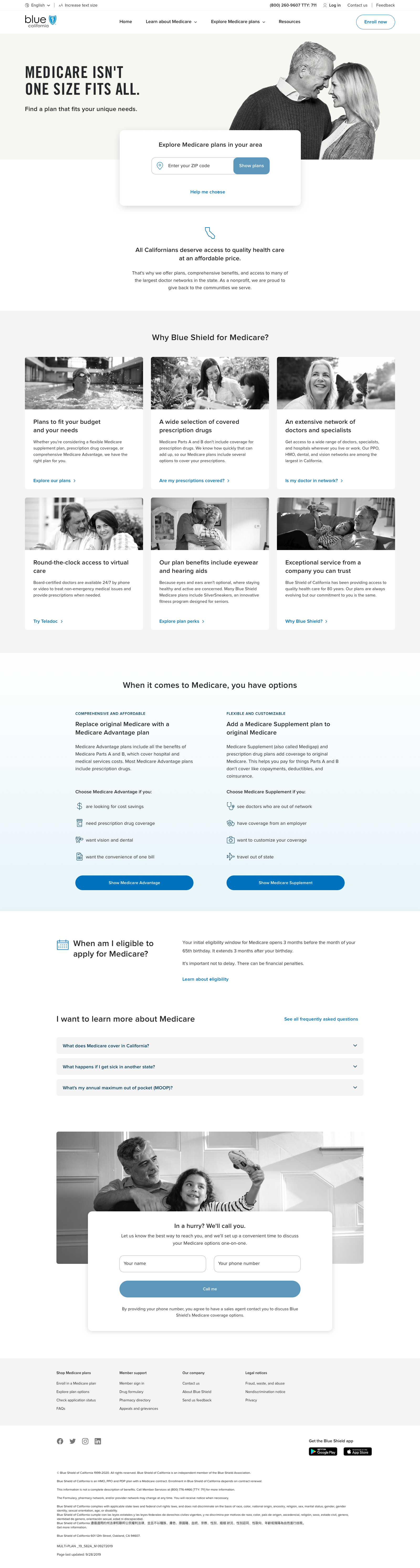
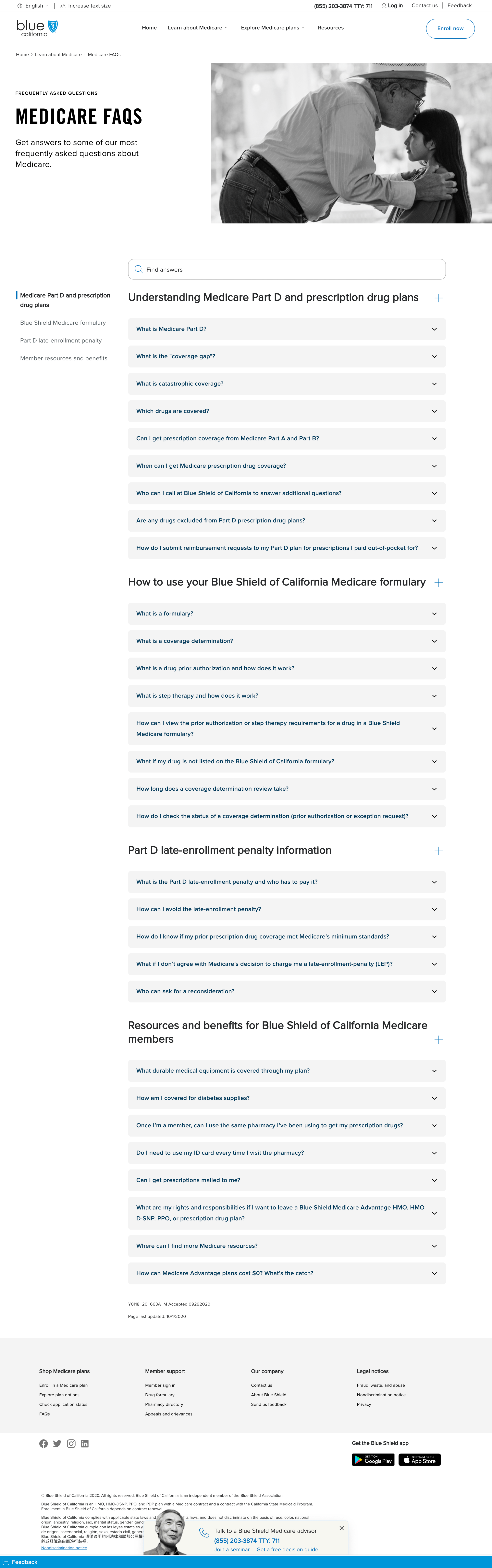
Understanding these behaviors was integral in re-organizing the site in the most easy-to-use way. This included designing several new responsive templates: Home, plan type comparison, landing pages for each plan type, plan listings, seminar listings, searchable FAQs, and resources. We were also able to introduce a mega menu that surfaced harder to find pages for improved discoverability.
We had the unique opportunity to pilot an entirely new look and feel with this microsite, and what we’ve created will serve as the foundation for overhauling the entire experience across Blue Shield digital products. I collaborated closely with our visual designer, and my expertise in interaction design was integral in designing accessible, scalable components, such as form fields, pickers, tables, and more. I was also able to provide guidance on text styles for optimal readability.
Result
Preliminary analytics show a significant drop in bounce rates and increase of time on page
I designed several new templates for the content management system with an all new look and feel. These versatile, accessible templates will inform future state UX across all of Blue Shield’s digital products.
After launch, even with limited traffic, the new site shows a significant drop in bounce rate and increase in session duration. At the end of the year, the old site will officially be retired and cutover to the new experience will be complete at which point, we’ll have a more complete picture of user behavior.
Next steps include more testing with actual users and further iteration, time and budget allowing.

New Medicare microsite

Old acquisition site